Tuesday, 1 April 2014

World Building 11 - Tentacle Treasure Chest


For this two-week assessment project, we had to create a treasure chest based off the provided concept art (above). We had the following restrictions:


  • 2500 Triangle Limit.
  • 1024*1024 Diffuse, Normal and Specular texture.
  • Textures must have a painted quality to them to match the art style.


To start with I just simply created two boxes and began to shape them to resemble the treasure chest. I found it easier to work with two objects separately like this, as I could isolate each individual part and really concentrate on it. I created the gems out of spheres, which I then cut in half, and then extruded the spikes on top of the chest's lid.


I made the legs as separate objects, though in hindsight and advice from Tanguy it would of been better to of had them as an extrusion from the body of the chest, so that the model was blended. Still it was a good learning experience and it was a challenge to keep within the triangle limit even when trying to keep the form of the object.


After I had unwrapped the model, I generated a normal map using mudbox, then used nDo2 to start putting together a normal for the fine details. Using nDo2 I generated a diffuse map, then started adding colour and further details, before finally adding specular. I did the textures by hand using my tablet and nDo2, however in hindsight I think photo sourcing the concept art would of been a better way to achieve the more painted texture and design. 

Finally for rendering and presentation purposes I brought the model into MarmosetToolBag2 and applied my materials and set up some nice lighting for rendering:


Overall I felt I've learnt quite a bit when using the program, the advise and feedback I've gotten from the project has been very helpful, and the use of tools like nDo2 hasn't definitely helped to speed up my workflow for quicker and better results. In hindsight, as I pointed out before, I think I would of attached the legs to the chest's body and probably spent more time on the seams to get it look that bit nicer.


Tuesday, 25 February 2014

World Building 10 - Burn Zombie Burn Gun

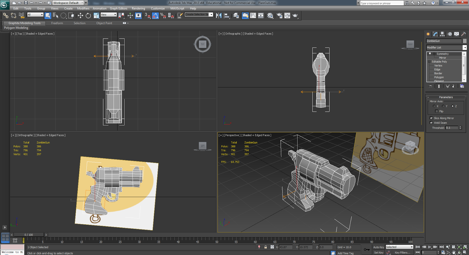
For this project we had to create a low poly Pistol based off the above concept art.

We had strict restrictions set for this project which included:

  • 800 Triangle Limit.
  • 64x64 Diffuse Texture
  • 128x128 Specular Texture
  • 256x256 Normal Map


 To begin with I started off by simply modelling the gun over the concept art, trying to keep the shape and cartoony nature of the pistol. I found the most challenging part to be in keeping the shape of the barrel and chamber, as in order to keep their roundness they made use of a lot of triangles.


After I was done with that I UV mapped the pistol, then created a higher poly one so that I could bake a base normal map from.


I then used Ndo to add additional details to the normal map, before baking a diffuse texture afterwards. I then added colour and then took the texture into dDo to add Ambient occasion and some more minor details.

Below is the gun with the high res textures:


And here it is after I compressed the textures down to their low res size:


Overall I enjoyed the project as it let me experiment with the benefits of different texture sizes, and how big the texture really needs to be in order to get the detail. Although it hurt me to compress the textures down, I can see the benefit of it especially for a low poly game with less details.

Edit: Render in Marmoset Toolbag:


Tuesday, 11 February 2014

World Building 9 - Trash Assignment


This week's assignment was emulating the kind of work that would be given to us in the industry. In this case we had to produce a low poly asset of trash that could be used in a urban environment.


It was really easy modelling the actual trash and boxes, however the difficulty I found was making the most of the 500 Triangle budget we had. At the time I found it difficult just to get near the triangle budget, but I tried to make the most of it by tessellating the planes inside to give more depth to the garbage inside the box.


UV mapping the model was the most tedious part, I used RoadKill to help sped up the process as it managed to automatically separate the maps for the different model elements inside the box. I then proceeded to texture the box using the photos of trash as reference as well as references from google. I also baked an Ambient Occlasion map in 3ds Max which gave the texture some local shadow.


Although the Ambient Occlasion is great, it does unfortunately hide the little details inside the trash box, which otherwise would be visible if it wasn't for the strong shadow. But still it is a cool technique in my opinion, and one I will apply to other works.

Edit: Marmoset Render:


Friday, 31 January 2014

World Building 8 - Tree

For this project we had to design a tree with character - not as a character, but rather with interesting aethestics to it.


For my moodboard I was mainly looking for images with a matching mood and colour scheme to it. A lot of images seem to be associated with this complimentary scheme and style, and since I wanted to base my tree off something in a swamp or marsh.


I started off by simply sketching in the basic scene, and the different background/foreground elements. I then started working on adding some value to the tree itself and some brushing on the swamp water.


I mixed a few textures on the swamp water and experimented with some different brushes to give the tree an interesting ccontrast to the rest of the image in both texture and sharpness. I experimented with the lighting to give the image more of a mood and tone.


I like the brushwork and texturing within the image, however I feel like the image's lighting could of used some work especially on the tree itself, as in my opinion it stands out too much from the background in a bi tof a cartoony way.

Thursday, 9 January 2014

World Building 7 - Dragon


For this project we had to design a dragon and do our own paintover, based off a model in mudbox.


For my moodboard, I was typically looking at typical fantasy dragon designs, normally seen in more western productions.

I started off originally with the intention of completely doing the project as an illustration, mainly due to the fact I can't really get on with Mudbox, as I find it can be confusing and unpredictable at times, when not working from a base mesh.


However in the end I decided to bite the bullet and attempted to create my model from scratch in the program. I decided to use what I had done so far with the illustration to use as a sketch and reference.

Due to time constraints and other difficulities, I didn't have time to really make a base mesh for my model, so instead I experimented with working from a sphere as I would do in sculptris.


I started off by pulling out the rough and basic forms of the dragon. I initially had problems with this particular method, as I would constantly have to raise the subdivision levels in order to produce more polygons for me to sculpt with. This is an issue as having to go too high poly too quickly, means I miss out on adding much needed detail, such as bumps and scales.

In hindsight it would of been better to use a base mesh - however as stated I had little time unfortunately in regards to this project and other commitments.


I made the wings and horns seperately in 3dsmax, before importing them into the scene. I'm happy with the wings shape however I think I made the base too spindly in hindsight, it should be much thicker at the shoulder muscle. I messed around with the different light settings and composition before rendering. I could not pose the model too much, as it took two minutes to reload the scene everytime I posed a part of the model - this got very infuriating.


Once rendered I brought the render into photshop, and duplicated and hid one of the renders to use as a lighting reference for later. I decided to wrap around kmodo dragon and iguana hide textures around the model to give it some colour and texture to the render.


Once I had every thing textured, I overlayed the render to use as a general lighting guide for my dragon. I then did some tweaking with the textures and depth, to highlight more muscles and uneven surfaces, due to the lack of bumps and surfaces on my sculpt.


I think overall I was pleased with the how my lightign came out in photoshop, it was less flat and more atmospheric than the lighting I've experimented with before. That being said, I think if I had more time on the sculpt I could of pushed the detail even further, as some more careful planning and detail on the sculpt could of resulted in a much better result and would of saved me some time with when it came to texturing and rendering.

In furture, I will definitely do a base sculpt to add the detail earlier on, so it will look alot better when it comes to the actual paintover.


Wednesday, 27 November 2013

World Building 6 - Christmas Card

This week we were tasked with designing a christmas card, to be printed out on A6.

For this project I was working with Ricardo Costa.


We started off with a rough sketch in order to get the idea and artstyle for the card, we opted for a more blocky/cartoony theme and rather than focusing on just Santa, we decided to have a bit more of a narrative.

For this Project we were going for a mix of illustration and 3d paintover to achieve the final the design.

Ricardo produced and created the major models that were needed, whilst I posed and rendered them, and brought them into photoshop to handle the illustration and paintover.


First we did was put the Reindeer into the scene, once Ricardo finished the model I posed it using the CAT system in 3ds max, then brought it it into photoshop in ordered to be painted. I did the same thing with the Sleigh.

The second model to be added was the child and christmas tree scene. Same as before with the reindeer, though this time I messed with glow effects for the lights on the tree.


Ricardo did a great job on the present machine and I had fun painting the details into it. However as I was working on the image, I decided to drop the tone the background down, as the white was clashing too much with the colours and scene.

We decided to change the angle of the Machine render, in order to make it more 3d/isometric. Unfortunately I had to re-paint it, but we still had time on our side. Next I did a quick render of the desk models Ricardo made.

I illustrated the students in the scene, although I was getting frustrated with how they looked, but deadline was approaching at this point.


The final addition to the scene was the final model of Santa that Ricardo did. I took it into the scene, but this time I set the render to Overlay and painted beneath it, in order to preserve the great lighting from the render.

Once we were happy with the composition of the card, I put together a border and Ricardo produced some text to finish the Card off.


Also did a variant with a different background.


Overall, I had mixed feelings on the result of this project. Personally I don't like the results of my illustrations, we had a lot of work during this week, which made it hard for me to give the project my all, however I will say it was a good exercise in teamwork, and producing a brief with a second person.