Monday 25 February 2013

2d Lesson 18 - Fire and Rock


The first thing we practiced this lesson, was to create lava convincingly using layer effects and blending in Photoshop. I practiced with a few designs first but wasn't happy with any of them, so I ended up painting a gargoyle, it's a rather simple sketch but I feel it's dynamic and I like the movement.

For the lava, I simply painted out the red markings where I wanted them to go, before adding the lava in on top using the layer effects shown in class.


Then second task was to use texture and minimal color to create a rock creature. I ended up going with the idea of the Greek Titan Atlas - who holds up the world. I had a lot of fun with this brief, and mine lesson in anatomy helped out greatly, I looked at a few reference images - most of which featuring a man being burdened with the weight of the world. I wanted to keep him as a recognizable human figure, but I think I gave his body enough texture and form to pass off as a giant mountainous force. I think an area for improvement could of been the feet, but I think I achieved the task of drawing attention to the face.

Sketchbook 14 - Pan's Faun


First sketch is the Faun from Pan's Labyrinth.

I was experimenting with shading with charcoals and pencil, fairly happy with how it came out, could of focused more on highlights however that's something for me to practice in the future.


The second was just a quick sketch of a barbarian holding his hammer aloft, it's an ok drawing, the anatomy is a bit off and I could of done a bit better on the shading.

Tuesday 19 February 2013

Life Drawing 9 - Dynamic Pose


This week in life drawing was a focus on more dynamic poses.


We started off with some very quick sketches of a variety of poses, the first lot being static, the second one a series of the model walking. I'm happy with how these came out due to the fact I'm finding its quicker to capture and map the form and anatomy of the human body - although if I only had a minute longer I think I would of been able to add in shading and further details.


I followed up with a couple of longer sketches, I had some difficulty with the anatomy especially on the one when the model is lying down, due to the difficulty of the angle and pose - but overall I feel a definite improvement in my life-drawing skill.

I ended with a quick five minute attempt to use shading and negative space to draw the model (image at top of the post), I'm quite pleased with this result and would like to explore further with a more variety of pencils and charcoal.

Monday 18 February 2013

2d Lesson 17 - Blending and Filters

This week we looked at using the  techniques featured in the artist Daarken's blending and debut tutorials.


The first was just a simple exercise on using the pen pressure to blend and smooth the head model. This technique wasn't anything new to me since I already use it, but I still found his chalk brushes to produce a nice effect.


We then had to follow his debut tutorial to create a grungy piece. I started off with a rough sketch, before filling in the basic values in black and white. I used Daarken's brushes for painting the grungy background, - the chalk one mainly.


My text task was to start adding some lighting and shadows - using overlay and dodge layers. I also added shadows in on multiply layers, along with some smoke to hide the unfinished part of the body.


I finished off by adding some extra glow, and just continuing to work in the shadows. I also used color balance layers to change the overall tone.


I'm in a mixed mind with how this came out. I think the lighting is OK  but it's bleached out the image due to the character's pale skin, I like the design of the character and Daarken's brushes really helped speed up the process of sketching him out, I feel like my knowledge of lighting and shadow is improving and I have found some useful techniques.

Sunday 17 February 2013

Sketchbook 13 - Chicken and Anatomy


My first sketch this week was just a weird bird creature I came up with, nothing really special, but I was messing around and I sort of liked how he came out - reminds me of something out of The Neverending Story.

Second was some anatomy practice, I had some trouble with the hands and arms, trying to get them right, but I I don't think they came out too badly overall.

Wednesday 13 February 2013

Life Drawing 8 - Inking


This week we once again had the female model posing for us.


Our first task was to start with quick five minute sketches, focusing on various poses - I'm fairly happy with how my drawings came out with this, I felt I got enough detail in during the small time frame.


Our second task was using inks to capture the pose. I had difficulty with, I managed to get a technique down after a few trys, but overall I feel that I certainly need more practice before mastering it.


We ended the lesson with two 30 minute drawings, I chose to use pencil and charcoal for this as I wanted to focus on my mark making. I felt these two pieces were a definitive success and I can see clear signs of improvement with my drawing overall.

Monday 11 February 2013

2d Lesson 16 - Robot Paintover Brief

Our latest brief was to create a model of a robot, render it and paint over it in a similar manner to the previous paintover brief.

Character Description:

A simple robot worker used on the production line of a large mega-corporation. Is cheap to build, and makes use of a pulley, and ball system for it's joints in order to lift and move heavy objects. Built to resemble a human structure - in order to provide empathy amongst the human employees of the corporation. 

Robot Research:

  •  Usually mechanical and artificial - if it includes organic material it is normally known as a cyborg.
  • Typically used in industry as free labour - can accomplish more tasks quicker than humans, without the need for pay or rest.
  • Can serve as the role of sidekick or villain in films and games - occasionally featured as protagonists.
  • In Japan robots are given the same rights as humans. (???)
  • More ethical questions are raised as robots become more advance - as whether they can be treated as just mere tools, if they develop consciousness.
  • Can be given human features - such as eyes, faces, biped bodies, in order to make them more appealing/relatable to humans.
  • Can be used as expendable weapons.
  • In media the quality of the robot can vary - from being crudely built out of parts (Star wars), to a seamless and high-quality almost organic finish (I-robot).
 I was looking at different examples of how robots could be built with a more human/lean figure, I liked the examples seen in the I-robot and Star Wars, especially with the way you can see how the robot's parts form together and fit.


Initially I was going to aim for a human face - but due to time and more lack of experience thus far of modelling human faces I decided to go for a more simple head- model. The Geth in Mass Effect and the Battle Droids in the Phantom Menace had some interesting head models- that were simple but gave them a unique design overall.


I had a pretty clear idea of my design, but I had a look through some other images of droids-particularly more retro ones- to inspire my more scrapyard droid look.


Concept:

I started off with some rough sketches and silhouettes of my robot, mainly I wanted to get the shape down - a lean and scrappy biped type robot.


I settled with the idea of the lamppost head on to the developed body I had on the far right image.


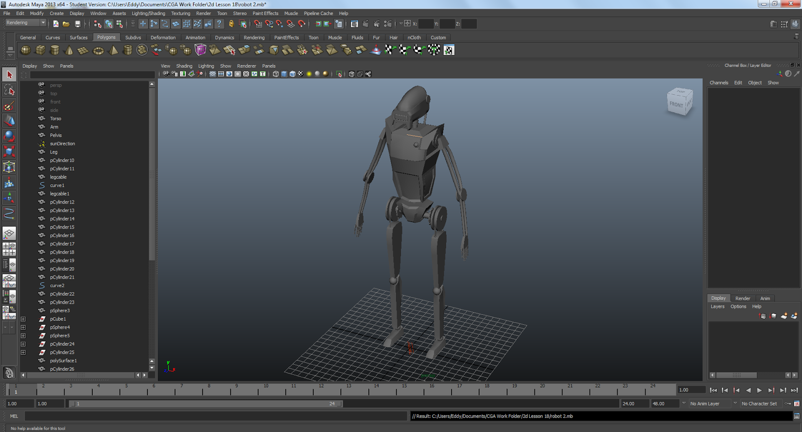
In Maya I started off with constructing the main body/chassis, using cube and simply and altering the proportions. For the arms, I mainly used cylinders to create the tubes and edited their vertices's. 


I then created the pelvis and started working on the legs - I kept everything divided, because I wanted to envision where the wires and pipes would go between the different limb pieces, that I would add later.

Here I started adding more details, such as the pipes I mentioned and gears - I wanted the robot to look very mechanical, but not overly sophisticated.


I started working on the head, which I found to be more of a challenge - the topology isn't great, as I had trouble figuring out how to mould it into the shape I wanted, still I managed to get a result I was happy with - for a paintover it's fine, but I would of put more work into the model if it was an actual game model.

Once done with modelling, I mirrored the arms and legs, then posed the model into a stance that I wanted the character to be in. I then added some basic metal materials to give it a shine, before rendering.


This is the render I produced to paintover with in Photoshop.


I started off by adding details to the render, such as painting on the glow of the head and bulb on the chest, and adding wires between the segmented body pieces - to add more allusion to the scrapyard effect.

Using the skew and warp tool, I started to wrap and add a nice panel texture I found, around the render - I found this a little more challenging than my last project's attempt, due to the harsher angels - but I feel it created a nice result.


Finally I added some additional details, enhanced the lighting, and painted in some more decals and highlights using some grunge brushes.


I'm very happy with how this render came out, I feel the lighting works well and I'm pleased with the model overall. I gained alot more confidence with using Maya in this project and I can see why the program is useful in creating organic/bipedal structures. If I had a bit more time and knowledge I think I would of gone into more detail on the hands and feet, but as it stands I'm very happy with the result of this project.