Wednesday 30 October 2013

World Building 4 - Halloween Monster

With Halloween coming out, we were given the creative freedom to design and produce a Halloween piece of our choice. I opted to go for a painting in Photoshop, as it has been awhile so I've done one from scratch.


I put together a moodboard of various monsters and Halloween designs, in hopes of finding some influence for my work.

I was particularly fond of the slender and creepy tree like designs of the Jack o Lantern and the Day of the dead skeletons.


Went with some silhouette designs for my sketches, I felt capturing a shambling and willowy form was the my best bet at producing some ideas. I took a liking to to the bottom three designs, and wanted to along the lines of that sort of ghoulish/alienish humanoid creature.


Took the idea of a slender ghoul further with three different behaviors. I liked the frame of the first one, but I really wanted to incorporate the frankensteined and stitched together form of the third monster.

First step was to open Photoshop and fill a document with a medium grey color.


Using a rough sketch as my starting point, I started painting in some basic tonal values and shade. I also darkened the background, so I had an idea of what atmosphere to be going for.


Once I had my very basic shades, I started working in more details on the ghoul, such as the stitches and shadows around the muscles. Once happy with the creature's form I turned my attention to the background and started painting in additional shadows and tone.


I continued to paint in the shadows, along with adding highlights. I dropped in some textures on multiply layers to add detail to the background. Lastly I began working on adding some colour and refining the lighting to highlight the detail of the monster.


I'm fairly pleased with the results of this painting. Although I did not get enough time to add to the finish that I wanted to the monster, I feel I did set out and achieve the level of mood and lighting that I had visualized in my head for the Halloween theme. I think with more time and practice I would of definitely of liked to render and smooth out the monster's form even further, along with adding additional details.

Game Mechanics 5 - Additional Models and Textures

This week, I once again worked on some minor additions, adding a few more box models and some tillable texture adjustments and additions.


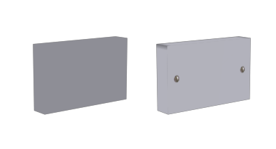
Really simple and boring box model for the wall plugs, really only real time went into the texture, which even then is flat. Minor detail that will not be noticed in the game, if even used.

Another simple and quick model, the same as the wallplug model, just a box with simple texture on it.


Managed to keep this very low poly'd despite the extra need for detail. Textures played a big part once again for these low poly models. Looking forward to seeing how the shaders in unity will look on the light.

I also produced a few extra tileble textures for the SU, as well as improving some of the older tiled textures, namely getting rid of shadows and trying to make them more seamless.


Nothing special really, but I wanted to at least have a few textures ready for when I have to start texturing the walls and floors of the SU itself.


Game Mechanics 4 - FIller Models

This week of the SU project, I was merely texturing and producing some of my own filler models to help populate the environment, whilst the bigger models were being created and worked upon.


This model was really basic, and easy to do, just a thin box that I manipulated into having curved sides. Put very little detail into it as it will be one of those models that will go unnoticed.

Another quick model, which was for the fire alarm. Again I tried to keep the polys and detail low, as it would only be viewed from far away, the textures are also low in size for that reason.
Although as small as the fire alarm, I had a bit more opportunity to add detail to this model. I had more fun with it, as I feel the texture was a nice and accurate portrayal of the actual object.


The last model I did myself for this week, was for the black candle shaped light. Had more fun doing this model than the others for obvious reasons, I had the opportunity for a bit more detail but at the same time I had to ensure the poly count and verts were as low as possible for optimisation sake.


Black Square Board model by Martin Garnett.

For this model I just had to simply texture the two sides, and add a wood trim. For the moment the black paper is a flat colour, but in the future we have discussed adding a normal map to it, in order to give it crinkles, detail and depth.

Overall I had fun producing some of my own models for the project, although only minor additions I was glad to be able to keep the workflow going.


Wednesday 16 October 2013

World Building 3 - SciFi Spaceship Paintover

For this project, I am tasked with researching and designing my own SciFi Ship. I'll have to look at various features clichés in this field and apply them to my own design.


I put together a mood board, with various ship designs and influences in order to help inspire me.

Typical SciFi ships generally share similar features and rules, to make them believable. These include:
  • Paneled and armoured hulls – which act as the ship's skin/armour that protects the vital components.
  • Cockpits or Bridge's generally tend to have thick glass to view outside the ship, or in some cases in some larger ship's designs they have a windowless Command room that allows them to view outside with radar.
  • Weapons are generally barrels that protrude or are inset into the ship, they can fire lasers or bullet like projectiles, depending on the setting.
  • A lot of large vessel designs in SciFi have swivelling turrets, such as the Death Star in Stars or the Galactica in Battlestar Galactica.
  • A lot of smaller ships seem to have some sort of air-vent, exhaust thing. Even though there is no air in space it's possible that it's their for when they fly into the atmosphere.
  • A common SciFi design is to have the craft, be propelled via thrusters, that tend to shoot out some sort of energy light/flare.
  • Ships can come with or without wings. Some wings even move up and down, to affect different speeds, aka the X-wing from Star Wars.

I started off with some basic sketches of various ship designs.


I wanted to have a small, one man craft – that can serve as a star fighter of some kind.


I settled on a sleek, simple design, similar to the X-Wing or Viper star ship.

Next stage was to make a basic model in 3ds Max that I could use as a base for my paintover.


I started with a simple cube mesh, then began to alter and extrude it to make the shape of the cockpit and body of the ship.


 I continued to extrude various details, including the cockpit and thrusters and exhausts.


I brought out the wings, and started finalizing details on the mesh.


Once I had placed the guns, I decided to UV unwrap the model - which was fairly tricky to be honest, as the topology was pretty poor.


But once unwrapped I put in some base colours and textures, and rendered the model with some decent lighting to bring out the bump mapped shaders.


 I put together a background in photoshop, I made the planet by taking a texture of an earth I found on Google then making it spherical using Photoshop filters.. The nebula was edited in, so that it blended with the planet.


I brought in my render and started painting in additional textures, lighting and effects.


I am content with the final piece, though I found doing the model slowed me down and I would of rather design and sketched the ship out by hand first, rather than having to do a paint over. My biggest gripe was with the model itself, due to time constraints I had great difficulty with getting the model how I wanted it to look overall and the quality was not something I was particularly happy with. But still as a basic reference it served itself well for a paint over piece.


Game Mechanics 3 - Asset Textures

In this second week of our group project, members of our group started modelling assets for the level. I was tasked with texturing some of them.
Gray Table model by Max Leah.

The gray table was an easy one to texture for, though I feel like the detail in the texture gets washed out in rendered lighting. Hopefully in unity this will not be the case, or if we have more time, we might be able to use shaders to keep the detail in.

White Table model by Max Leah.

The White table was simple to texture, but I was happy with how it came out, the textures were very close to that of the actual reference. Only downside is we will have to remodel the table, as we found there's an extra part that comes down underneath in the middle.


Three Seat Sofa Model by Martin Garnett.

The the sofa was a little trickier to do, mainly because unlike the other models it had details in it's textures like the seams and creases. I had to Redo the UVW map a few times, until I was happy with how the textures and maps were laid out.

Roof Light model by Max Leah.

The roof light was easy enough to texture, the main focus was mainly on the bulb underneath, but even then that will most likely be covered by a lens flare.

Thursday 10 October 2013

World Building 2 - Box Modelling Minotaur


This week we had the task of creating a Minotaur using a box modelling method, which was detailed to us in a tutorial.


I put together WIP screenshots into a slideshow, in order to show my progress.

I did not get around to finishing the task, as it was a challenging one. But I felt the methods I learnt will be very useful to me in the future, when it comes to modelling especially humanoids.

The major problem I had with the tutorial though, was the lack of coherent explanation of what tools did what, as they are they not the same in Silo and 3ds Max. I also had trouble with the symmetry on my model, which produced some bugs when I was moving in it's mouth.


Game Mechanics 2 - Textures

We have been assigned a group project - which is model and map the student bar, and to interact with it as if it were a playable level.

In this first initial week we are merely setting things up. As part of the texture team, I was assigned with the task of creating some tillable textures, until models are made.


In order to check the textures tiled okay, I set up a scene in photoshop with some uv mapped walls, and tweaked the textures I made until they tiled without seams.

I'm pleased with how a few of the textures came out, namely the floor tiles, but I could still use some works on the bricks. I found it challenging to make the textures well, using the photo references, as it was hard to avoid shadows and misplaced colours.

Wednesday 2 October 2013

World Building 1 - Aquatic Life Paintover

This week, our task was to research and design our own underwater creature, and produce a paint over as a result.


Some of the main features I discovered about marine life were:


  • They have gills on either side of their body, that connect to their lungs which allow them to breathe underwater.
  • Most fish have sleek bodies in order to cut through water, with reduced friction.
  • Their fins are normally made of spines.
  • Most fish tend to have skeletons, despite their flexible body, normally made of cartilage.
  • No external ears or eyelids.
  • Fertilization takes place externally outside the body.
  • Eyes are on either side of head, or some fish don't even have visible ones.
  • Some fish like squids and jellyfish are spineless.
  • The deeper you go underwater the weirder the fish tend to look.
  • Fish that live around coral, can have some type of camouflage.


I also put together a small moodboard, in order to highlight key features as well as do a few sketches of the fish I've researched.


I also did a few sketches to get a few ideas, mainly concentrating on greatly differing designs in order to have variety in main features.


I settled for a combination between sketches 2 and 5. I liked the overall intimidating design of sketch 2, but I wanted to include more curves and the alien design of 5 in it's form.

Next stage, was to start creating a rough model in Mudbox.


Started sculpting the head from a simple sphere prefab, once I was satisfied with the details, I began to stretch out its body, and adding subdivisions for extra details and polys.


Started bringing out the creature's fins, and adding finger details to it's mouth. I also pulled out and sculpting it's back tail and fin, adding additional subdivisions to add more polys and smoothness to the model.


To create the correct pose, I added joints and put the fish into a decent pose. I also used Mudbox to edit the lighting and add additional shadows and detail.


I produced three different renders, with three different compositions and lighting, before deciding which one to use as the final render.


I took the render into photoshop, adding textures and some underwater effects, as well as tweaking the lighting.

I'm quite happy with how this project turned out, although I would of liked a bit more time to work on the paint over, possibly adding more finer details. But I am quite pleased with the sea monster's design, hopefully with more experience in mud box, I'll be able to create something in more detailed and authentic.