Showing posts with label photoshop. Show all posts

Thursday, 6 November 2014

Designing the Main Character Part 1


For our main character we agreed upon expanding on the initial sketch of him, using him as a base idea for our model's inspiration.


Although we had a initial design I decided to try out some different themes for the character and his outfit.

I started with some rough silhouettes that I painted up, I left them unfinished however as I was getting frustrated with their designs and couldn't think of one I was happy with.


Instead I decided to work on some sketches divided into a variety of layers so I can easily move the different clothes and heads around, my aim was to have a variety of different styles so we can combine the group's favorite features together into one character design.

After deciding on some features, I began modelling a base mesh and test model for our grey box, based off the most favorable features.


I started by using makeHuman to create a base mesh for the character, then from there I began creating the symmetrical base of the model.


Once I was happy with the base, I made a rough mesh for his hair, making sure it's against the head model's faces.


My next stage was dragging out the tabard/tail coats, I extruded this from the model then just made sure it stayed hung in place.


Lastly I modeled the extra bits and pieces such as the belt and wrist bracer, so that our animator could keep these objects in mind when he started rigging.


I then sent the base mesh to zBrush to have a go sculpting and adding detail to the clothes, I then baked this into a normal using xNormal.


Finally I made my diffuse out of the normal map and a AO map, then just edited it in photoshop.


For a very early model for our test tutorial, I am happy with the results. Obviously needs more work in terms of sculpting and normal maps but I intend to practice more with zBrush considering I had not used it before.

My next goal for this model will be to work on it's final design:

Summer Pre Production Ideas and Artwork

During the summer we took the opportunity to come up with some ideas for our game. We settled upon an adventure came, with a focus upon a few but powerful enemies that you had to use your wits to get past as opposed to button mashing attacks.

With this in mind I produced a few sketches and ideas at the end of summer for our project.


First thing I did was a rough story board proposing a scenario with one of the enemies in the game, where our player has to navigate a tunnel maze and use his lantern to escape from the boss. Our group was fairly fond of the idea of using puzzles and wits to defeat the boss and we decided on making this one of the main features of our game.


 Secondly I did a couple of sketches suggesting what sort of characters we might have in our game. We agreed upon a slight arabian/desert inspired setting, hence the whites and loose clothing on the characters. The drawing of our human main character served as the initial basis of our protagonist's design, and it's something I plan to take further. On the other hand the troll, as fun as he was to design wasn't really a character we're going to take any further - rather we'll have a focus on more large and bestial type enemies such as birds and worms.


I also put together a moodboard, so we can have a focus on our art style and how we want our game and locations to look.

Overall I felt these sketches served as a good way of initiating ideas, and I hope to practice further during pre production in order to have a better presentation on my artwork.

Thursday, 3 April 2014

Vertical Slice: Character Design


My task for our Vertical Slice Project, was to design and create the player character and enemies in our world.


 I did a few initial sketches for the some of characters we would have. Since our game is a colourful platformer we were looking at animal protagonists.


We eventually decided on a sort of voodoo/shamanistic theme for our game, here I created some ideas for what some of items and weapons we could have in the world.


Next thing we looked at were enemy designs, and ideas for creatures in the world. Keeping in mind this is a voodoo based game, and our level takes place in a swamp, I wanted to look at sort of enemies that could belong in both worlds.

The image on the right was an idea for a potential boss character that would live and swim around in a swamp.

Next was deciding on the outfit and design for our character. We agreed on having him be an otter, so I did some sketches of difference outfits, with the one on the far right being the design we all agreed on.


I did a more detail paint up of the character, however after some discussion I edited the colours so that it would be more bloomy and bright, to appeal to a more general audience, as the washed out colours were sort of bleak.

Tuesday, 25 February 2014

World Building 10 - Burn Zombie Burn Gun

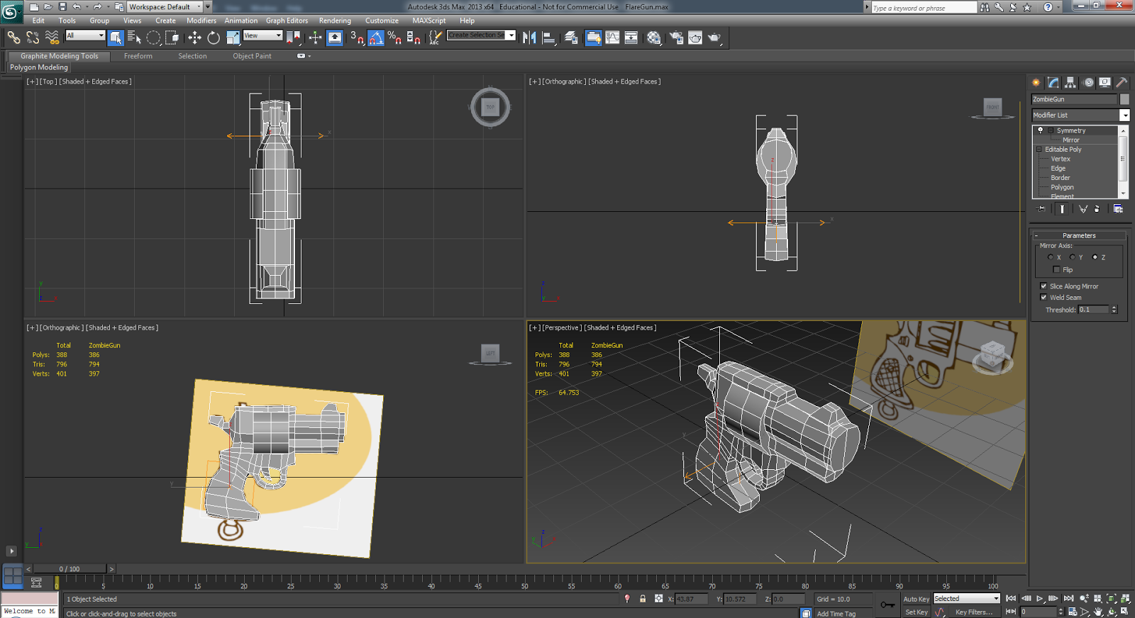
For this project we had to create a low poly Pistol based off the above concept art.

We had strict restrictions set for this project which included:

  • 800 Triangle Limit.
  • 64x64 Diffuse Texture
  • 128x128 Specular Texture
  • 256x256 Normal Map


 To begin with I started off by simply modelling the gun over the concept art, trying to keep the shape and cartoony nature of the pistol. I found the most challenging part to be in keeping the shape of the barrel and chamber, as in order to keep their roundness they made use of a lot of triangles.


After I was done with that I UV mapped the pistol, then created a higher poly one so that I could bake a base normal map from.


I then used Ndo to add additional details to the normal map, before baking a diffuse texture afterwards. I then added colour and then took the texture into dDo to add Ambient occasion and some more minor details.

Below is the gun with the high res textures:


And here it is after I compressed the textures down to their low res size:


Overall I enjoyed the project as it let me experiment with the benefits of different texture sizes, and how big the texture really needs to be in order to get the detail. Although it hurt me to compress the textures down, I can see the benefit of it especially for a low poly game with less details.

Edit: Render in Marmoset Toolbag:


Tuesday, 11 February 2014

World Building 9 - Trash Assignment


This week's assignment was emulating the kind of work that would be given to us in the industry. In this case we had to produce a low poly asset of trash that could be used in a urban environment.


It was really easy modelling the actual trash and boxes, however the difficulty I found was making the most of the 500 Triangle budget we had. At the time I found it difficult just to get near the triangle budget, but I tried to make the most of it by tessellating the planes inside to give more depth to the garbage inside the box.


UV mapping the model was the most tedious part, I used RoadKill to help sped up the process as it managed to automatically separate the maps for the different model elements inside the box. I then proceeded to texture the box using the photos of trash as reference as well as references from google. I also baked an Ambient Occlasion map in 3ds Max which gave the texture some local shadow.


Although the Ambient Occlasion is great, it does unfortunately hide the little details inside the trash box, which otherwise would be visible if it wasn't for the strong shadow. But still it is a cool technique in my opinion, and one I will apply to other works.

Edit: Marmoset Render:


Friday, 31 January 2014

World Building 8 - Tree

For this project we had to design a tree with character - not as a character, but rather with interesting aethestics to it.


For my moodboard I was mainly looking for images with a matching mood and colour scheme to it. A lot of images seem to be associated with this complimentary scheme and style, and since I wanted to base my tree off something in a swamp or marsh.


I started off by simply sketching in the basic scene, and the different background/foreground elements. I then started working on adding some value to the tree itself and some brushing on the swamp water.


I mixed a few textures on the swamp water and experimented with some different brushes to give the tree an interesting ccontrast to the rest of the image in both texture and sharpness. I experimented with the lighting to give the image more of a mood and tone.


I like the brushwork and texturing within the image, however I feel like the image's lighting could of used some work especially on the tree itself, as in my opinion it stands out too much from the background in a bi tof a cartoony way.