Tuesday, 26 March 2013

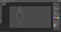
2d Lesson 21 - Skeleton Overlay


This lesson we just did a quick skeleton overlay, to put forward our knowledge on anatomy.
 
We had to simply paint the skeleton over the runner to try and match the bone movement accurately, I think I achieved the task quite well, although I did not worry too much about detail due to the nature of being a quick sketch.
 
I can see that studying anatomy has helped quite alot.
 

Monday, 25 March 2013

2d Lesson 20 - Skeleton Anatomy Study

This week's brief was to study the human skeleton, do research and paint an illustration annotating various bones on the skeleton.

Research

  • Humans have 24 ribs, consisting of 12 pairs - the first seven and most visible ribs are known as the true ribs and attach directly to the sternum.
  • The skeleton has a variety of joints that include:
    • Fibrous joints connect the bones and restrict movement.
    • Cartilaginous joints connect the bones with cartilage and allow little movement.
    • Synovial joints allow for the most movement. 
    • The Hinge joint allows extension and retraction of an appendage. 
    • The Saddle joint allows movement back and forth and up and down, but no rotation.
    • Ball and socket joints allow for radial movement in all directions.
    • Ellipsoid joints allow radial movement but to a lesser degree.
    • Pivot joints can rotate limbs around an axis.
    • Plane/Gliding joints allow bones to slide past each other.
  • Females tend to have larger pelvis bones than males.
  • The fore-arm consists of two bones, the radial and the ulna that twist around one another to form movement in the fore-arm.
  • The segmented sections of the spine slide over one another to form bends and movement in the body.

To begin my study, I started with a few sketches of various different bones.


I first looked at the various different types of joints, and drew examples of them from reference, I was surprised at the variety of joints and how machine like they were. I made sure to annotate the way the different joints move for reference - this will help me in the future, when posing characters as I'll be able to know which limb can move in which direction.


The second lot of sketches was just of a few bones that I wouldn't be studying up close in the full body skeleton illustration, I decided to pick some of the larger bones, and just had fun sketching out they are formed and connected.


 I started off by simply sketching out the rough location of the bones and from reference, it wasn't particularly difficult - and it actually comes across as being quite easy to pose the skeleton when you realize how the joints are connected.

Once I had gotten all poses painted, I made some corrections to the shadows and lighting, and also altered the length of the legs as they were looking a little short.


When I was happy with what I had I made a copy with annotations to the various bones and joints.


Overall I m pleased with the outcome, although admittedly I had little time to work on it, as due to the myuca website being down for me, I only received the assignment the night before, but given the limited time I feel I've done well and broadened my understanding of the human skeleton in this quick study and illustration.

Wednesday, 20 March 2013

Life Drawing Lesson 11 - Skeleton Redux


This week we returned to looking at the skeleton installation that we drew near the beginning of the life-drawing lessons.


 Unfortunately I was late to the lesson, due to trains, but we started off with doing very quick sketches of our classmates in various poses, using both our left and right hand. I struggled catching up with this exercise, and I'm not particularly happy with how the sketches came out, but I feel the majority of the poses are drawn well.


For the final two sketches I made use of a brown coloring pencil, and I found it very useful to do my drawings. On the first drawing I stuck with line art and I'm fairly happy with how the skeleton came out- I think the arm is a little off, but I overall I'm quite happy with the drawing.

For the last sketch (image at top of post) I used the pencil to shade, and this gave a much better sense of dimension and detail, I really enjoyed using this particularly medium, it was easy to control the tone and if I had more time, I think I could of done a really accurate anatomy illustration.

Wednesday, 13 March 2013

Life Drawing 10 - Female Model 3


This week we had a new female model in, and our aim was to concentrate on using alternate techniques.


To begin with we started with trying to trying to draw the model's silhouette using a single-line, I'm happy with the turn out on this exercise - as I feel the silhouette is very strong, though it was a challenge to capture the pose within the single use of a line.


The next set of exercises was to use a variety of media to draw her. We started with a sketch with using the left hand- I found this incredibly difficult, due to the face my arm wasn't comfortable with drawing this way, and many of the lines were twitchy. The next two images were done in charcoal then in felt pen- the latter of which I didn't enjoy as I could not use shading at all, so the image came out very cartoony.


The last two longer sketches, were done with charcoal, and I'm proud with the turn out on this - I feel my sketches have gotten lot more 3 dimensional - and are far more interesting to look at.

Monday, 11 March 2013

3d Lesson 19 - CAT Animation Lesson

This week's assignment was to work through a set of CAT Rigging tutorials for 3ds Max, in order to create our own animations and bipeds.

Part 1 - Preset Rigs

The first tutorial introduced the preset rigs that came with the CAT software, in this case I used the base humanoid.


The CAT biped is far more user friendly version of the standard biped, I did not have any trouble setting it up around the provided model.


Once I had the biped wrapped around the model, all I had to do was add a skin modifier, and then I played one of the pre-loaded animations that CAT has built into it.


To my surprise the model animated fairly well even without weights, I really like the biped as it cuts down on the amount of work needed, compared to using the default built in biped.

Part 2 - Custom Rigs

The next thing was learning how to make my own custom rig, for a model.


Thankfully this was far easier than I initially thought. I started off by making the pelvis and lining that up on the model, the next stage was simply to add legs then a spine and just gradually add more bones, or complete limbs from the inbuilt menu.


Once the main skeleton was done, I added additional jiggle/ detail bones for the belly and bane, before skinning the model the same way as the humanoid.


Even a custom rig animates really well, although it's not perfect, yet I can see this tool being incredibly useful in creating base rigs and animations.

Part 3 - Absolute Layers

The third tutorial was looking into the CAT's animation layers, which work as a way of separating and blending animations together.


To start off with, I made a new animation layer, and animated the rig in a handshake animation - this is a useful tool as it makes it far easier to sort through animations and poses.


I created a second layer, which is displays over the first, and animated the rig waving. The tutorial ended by explaining how I can use the layer weights, which work much like opacity in Photoshop  to blend animations together, or to hide one or the other.

Part 4 - Adjustment Layers

Adjustment layers are a quick way of tweaking an animation.


I imported an animation from another biped and merged it with my current one, they merged together but I had to tweak my biped to even out a few errors. This is where the adjustment levels came in, and allowed me to tweak and straighten out the bones.


I found this feature really cool, as I could perfect an animation over time with a few small tweaks.

Part 5 - CATmotion Layers


The final layer type was the CATmotion layers. I'm assuming these import preexisting built in animations or animations captured from mo-cap suits.


Anyway, this was another simple task of simply, altering existing values to turn the default CATanimation run, into something far more believable. I also noted that I did not have to alter any existing weights, as altering the values of the animation altered the weights of the model to smooth out the animation.


I could also have the animation follow a path, that I constrained the model to, on top of this the path can edit itself to walk over terrain.


I really enjoyed using this tool, and I definitely would consider trying out animating overall if projects made use of this feature.

Sunday, 10 March 2013

Sketchbook 16 - Mouse and Elcor


The first sketch this week was just of a swashbuckling mouse I drew, slightly inspired by some books I read when I was younger. Quite happy with how it came out for a quick sketch, I can see my proportions getting stronger.


The second sketch is of an elcor from mass effect, that I referenced from the art book. Was concentrating on shade and form, it came out ok, nothing special.

Monday, 4 March 2013

2d Lesson 19 - Man, Elf, Dwarf

In this lesson we were looking at different proportions and builds, in this case a dwarf, man and a elf.


I started off with initial sketches of the character's frames - I wanted to start with an accurate depiction of their body and frame, before I add shading and clothing.


Once I had the base done, I began sketching in the clothing and armor designs, before adding colour once all the values were complete.


After the colour was added, I tried to repaint in some of the values along with extra details, I wasn't too happy with the initial lighting, but I could edit so much.

Anyway overall I'm satisfied with the painting I'm not 100% pleased with it, but I feel I have learnt quite a bit in terms of stance and proportion from working on it.

Sunday, 3 March 2013

Sketchbook 15 - Greek Myths


First sketch was of a chimera from Greek mythology, I'm happy with how the body and head came out, but I think the tail is rather crap - the camera quality doesn't help too much either.


Second was a quick sketch of a Greek statue, I wasn't on form this week with drawing - was tired and busy, so I'm not very happy with the result of this - it's too cartoony and the shading did not come out well.