Wednesday, 28 November 2012

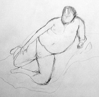
Life Drawing 5 - Male Model


This week in life drawing, we had a male model posing, and had to produce timed sketches of him in different poses.

Initially I had difficulty but as I found as I did more drawing, it became easier to visualise the proportions, and break up the anatomy. I did find myself struggling with the perspective of most of the poses, and I found the proportions were even more difficulty to get accurate as I wasn't used to drawing this particular model's build.


Tuesday, 27 November 2012

Sketchbook 9 - Action Figure and Monsterscape


First sketch was of an action figure I've own for years, I felt it would be a good model as it has human proportions and an interesting character design. I'm fairly happy with how it came out as a sketch, I felt it rendered quite well, I'm confident that my shading technique is coming along.


This is a sketch of a cityscape being attacking by a giant monster. I was very happy with how the shading and texture came out on the monster, although the camera obscures this somewhat. My next aim will be to practice more with drawing humans in perspective.

2d Lesson 10 - Oil painting

 
This exercise was to paint up a character in photshop, using provided line art, with a particular technique.

I put in flat colours first, then added a base shadow, before rendering the light with a hard edged brush. I like this technique quite alot, it produces fast results, and has a nice distinct style.

I also learnt about mixing colours to create lighter and darker areas rather than just adding black or white, this was a really useful technique is it helps me keep the colours from washing out.

Monday, 26 November 2012

2d Lesson 9 - Character Design


In this lesson I  had to use Sculptriss to design a steam punk frog character.

I started with a basic sketch to give me a rough idea of what to make.


The Sculptriss program works in a similar way to Z-brush in the fact that we have to sculpt and mould the model, rather than work with polygons. I found it fun to use and the click and drag control scheme very user friendly.


Once I had a basic model done, I simply rendered it and took it into photoshop to be painted over. I found this a good way to quiclly design organic things and it eliminates the need for doing line art. I really enjoyed this method of designing characters and I hope to do more of it in the future.

As for the painting I was happy with my character's design, I had to create the model if photoshop when I did my paint over, but otherwise Sculptriss supplied a solid base. I think I maybe should add goggles to the frog or something to maybe make the Steampunk theme more obvious, but other than that I think it holds up as a concept well enough.

Wednesday, 21 November 2012

The Swordsman


Click for full image.

Another personal drawing I did, for a fantasy set of characters. I used the same techiniques as before, but this time tried painting with textures to add more detail to the armour.

Tuesday, 20 November 2012

Sketchbook 8 - Commuter and Banana Warrior


This was a quick sketch I did of a guy on the train as I was coming home. I didn't try to be too accurate with it instead I wanted to capture his form and defining features, as I wasn't certain as to when he would be getting off the train. I think it came out ok, but if I had more time I could of definitely refined it more.


This was a design for a banana warrior I came up with, I'm very happy with how it came out, I was pleased with the composition and shading and I feel like it could be a strong character design for a project in the future.

2d Lesson 8 - Bug Guy


In this lesson I was tasked with painting in a line art of a giant bug, using textures referenced from a photo of insects.

I found this to be a quick method of applying texture and material to an image, by layering the texture on and painting/smugding it into the painting. I used the textures exclusively on the bug, before adding in grass and a background. I added rain and a color filter for atmosphere.

I did not particular like this task too much, as I found painting with textures to be rather trial and error than an accurate method of painting. Although it produces nice texure and surface, I think in future I would rather paint using more traditional methods.

Monday, 19 November 2012

3d Lesson 10 - Texture Unwrapping


In today's lesson I used the UVW Unwrap tool to accurately edit and align textures to a model.


Starting with a cylinder I used the unwrap tool to move and position the uvw map so that the tin's base and sides were located separately.

 
Then all I had to do was to render the uvw map (which give me a wire frame image), and texture it in photo shop.
 
For the t-shirt, I had to pick either side of the t-shirt and apply a planar map to it, in order to create a copy for the front and back, as well as introducing seams.


Finally I positioned the back uvw map over the front, and using the stitching tools to stitch the seams together so the texture can pass through seamlessly, and without any misalignment.

Although a simple design, I like how the T-shirt came out, there wasn't a need to use a too busy texture, and I can see no stretching on the design. There are more automatd ways of doing this but I think overall this was a good introduction to using the UVW Unwrap.


Thursday, 15 November 2012

Life Drawing Lesson 4 - Mixed Media


In my latest life drawing lesson, we had another skeleton installation set up, however this time we got the choice of what to draw and what media to use.


 I started off by sketching with pencil, the I added shadows using ink, before finally using charcoal to outline, and add a few minor details to the sketch.

I was very happy with how this piece of work came out, however I would of preferred the paper to be a bit thicker so I could make more use of shades with the ink, as most of it absorbed to be one shade.

Tuesday, 13 November 2012

Sketchbook 7 - Cathedral and Landscape


 When I was in Canterbury I decided to visit the cathedral. Whilst there I did a quick technical sketch of it in two point perspective, it was a challenge with all the buttresses and spires and I didn't completely finish it, but I feel I got the basic design down regardless.

 
This was a landscape sketch I did, I wanted to concentrate on creating tone and mood, and give it dusky feel. I'm fairly pleased with how it came out, although I failed at trying to create convincing water on the left where there was meant to be a river.

2d Lesson 7 - Lizard Dude

 
Using supplied line Art I had to paint and render a drawing of a Lizard Man. I started by painting the values in black and white, but once again adding colour on a colour layer. I also added a texture overlay of snake skin, to get it looking more realistic.

Personally I'm not too happy with how it came out, but I know what I need to focus and put my practice into now, need to work on smoothing out shadows and highlights. I think the colour might of been too loud and I could work in more subtle shading.

Monday, 12 November 2012

3d Lesson 9 - Bounce


We had a short lesson on animation today, focusing mainly on bouncing and convincing gravity.


The task was simple but very educational. I had to create a ball rolling and bouncing down some stairs in 3ds Max, which I did with the movement tool. I then had to open up the time line ui in the animation window and alter the trajectory in the time line - making the points where the ball 'bounces' a fast contour to give off more realistic gravity and movement.

I also applied a stretch filter to the sphere, and squashed the ball slightly when it landed and stretched it slightly when it's reached it's high point, this helped to exaggerate the movement of the bounce.

I found this a fun exercise, and I'm extremely happy with how my resulsts came out - I kept the squash and stretching subtle which I think worked in my favour, as it didn't destroy the realism of the movement, but made it a bit more interesting to watch than none at all.


Thursday, 8 November 2012

The Scoundrel


Click for full image;

A personal piece I did for myself, depicting a typical roguish character in a fantasy setting. I wanted to do a set of such archetypes for fun and practice, so this is the first of hopefully many.

I utilised the methods we were taught in class, starting with a rough silhouette and adding values, followed by colour.

Life Drawing 3 - Chairs and Ink


This week we had the challenge of drawing a pile of chairs through the perspective grid using charcoal. However this was very difficult, as the shape of the chairs were complex in themselves, and with the added effect of the grid it made the piece very challenging, I had great difficulty with it, I need to work on constructing straight lines in particular.


Our second task for the day was another skeleton based installtion, this time within the perspective grid.


I produced two drawings using ink and a lolipop stick. I found this to be quite fun, as I took a different approach to drawing these. I aimed to create the suggestion of form and movement using merely lines, rather than sketching the form out accurately. I was pleased with how it turned out and they proved to be a good practice for working with perspective.

Tuesday, 6 November 2012

Sketchbook 6 - Room and Gentleman


Here I did a drawing of my girlfriend's room when I was staying at her campus, I confused myself a bit with the perspective when it came to drawing the room and it stretched it out a bit, but otherwise I'm fairly pleased with how it came out. I do need to practice drawing with perspective a bit more when it comes to rooms.

This was just a sketch of a victorian mage/gentleman, once again I concentrated on the shading more to try and capture the lighting and shadows within his outfit.

2d Lesson 6 - Monster ball


The 2d lesson this week was the same as the previous one last week.

I'm much happier with how this piece came out, I found that practicing with painting values made it far easier for me this time around, when it came around to shading. I also focused on making the lighting/shadows stronger and more obvious, so that when I came around to colouring it, it came across as more 3d/realistic and less flat and cartoony.

I'm happy with the design, I think the top might be a little washed out, but I feel the creature has enough texture and shading to stand up well as a design. I enjoy these technique alot, but I would like to try other styles of painting soon in the future.

Monday, 5 November 2012

3d Lesson 8 - Hey Chef

This lesson we were tasked with doing a quick animation, using our own south park character we created.


The aim was to create a character talking, so animating both their lips and movement to fit in with a audio file. This was achieved by using the Dope sheet in the graph editor, to hide and show multiple mouth textures, to create an illusion of lips moving. The same thing was done with the eyes for blinking. I added the audio file first, then arranged the different textures to show/appear when appropriate.

I found this animation to be a pain, 3ds Max lagged in the animation window and had a tendacy to crash when I deleted or moved a key frame. In the end I only did the base work as it was incredibly frustrating to just do this small piece of animation. I feel I would of done alot more to a higher standard if 3ds Max was responding better or I was using a different program for the task.


Thursday, 1 November 2012

Games Encounters 2 - Unity Scripting

 
I've made quite a few additions to my unity Project since the first update. We had mainly been focusing on scripting to add features to my world.
 

The very first feature I added was a campfire. Using a stock model, I placed it in the world, and then added particle effects to the model to create fire and smoke. These were easy to create as they were just textures with an alpha channel.

The next task was to add a scrip to turn the fire on via collisions. My first part of the script was a function to pick up a set of matches from the world, once the matches were picked up and 'added' to my character, I could then walk to the fire and light it. The script checked whether I had any matches on me, and if I did it would add the fire particle effect.


To add some challenge to game world, I placed the matches inside a wooden hut that was locked. It could only be opened by obtaining four batteries, in the same manner that we obtained the matches. Once the batteries were collected the door would open when colliding with it. I also added a GUI to the game showing how many batteries had been collected.


I later replaced the hut with a model of a crashed helicopter that I made in 3ds max, that would open in the same way.


For another challenge, I imported a target range, and removed one of the batteries from the world. The aim was to 'win' the last battery by beating the target game. The targets were animated, and would stand up in their idle state, and would fall down when a projectile collides with them.


I then had to make a launcher script, that would fire coconuts when pressing the left mouse button. The coconuts are merely textured spheres with a collider on them. When the spheres collide with the target it becomes knocked down.


When all targets are down, a script spawns the final battery.

I've learnt alot from these past few weeks of working with unity, I hope to go back and polish some of these elements, aka texturing the helicopter, etc. But where it stands I think I've got a solid framework to begin expanding on certain game features (shooting, expoloration, etc)