Wednesday, 27 November 2013

World Building 6 - Christmas Card

This week we were tasked with designing a christmas card, to be printed out on A6.

For this project I was working with Ricardo Costa.


We started off with a rough sketch in order to get the idea and artstyle for the card, we opted for a more blocky/cartoony theme and rather than focusing on just Santa, we decided to have a bit more of a narrative.

For this Project we were going for a mix of illustration and 3d paintover to achieve the final the design.

Ricardo produced and created the major models that were needed, whilst I posed and rendered them, and brought them into photoshop to handle the illustration and paintover.


First we did was put the Reindeer into the scene, once Ricardo finished the model I posed it using the CAT system in 3ds max, then brought it it into photoshop in ordered to be painted. I did the same thing with the Sleigh.

The second model to be added was the child and christmas tree scene. Same as before with the reindeer, though this time I messed with glow effects for the lights on the tree.


Ricardo did a great job on the present machine and I had fun painting the details into it. However as I was working on the image, I decided to drop the tone the background down, as the white was clashing too much with the colours and scene.

We decided to change the angle of the Machine render, in order to make it more 3d/isometric. Unfortunately I had to re-paint it, but we still had time on our side. Next I did a quick render of the desk models Ricardo made.

I illustrated the students in the scene, although I was getting frustrated with how they looked, but deadline was approaching at this point.


The final addition to the scene was the final model of Santa that Ricardo did. I took it into the scene, but this time I set the render to Overlay and painted beneath it, in order to preserve the great lighting from the render.

Once we were happy with the composition of the card, I put together a border and Ricardo produced some text to finish the Card off.


Also did a variant with a different background.


Overall, I had mixed feelings on the result of this project. Personally I don't like the results of my illustrations, we had a lot of work during this week, which made it hard for me to give the project my all, however I will say it was a good exercise in teamwork, and producing a brief with a second person.

Friday, 15 November 2013

World Building 5 - Surrealism

This week in world building we had to produce a piece that was surreal and a bit on the strange side.


I started off with just producing a moodboard consisting of strange and surrealistic pieces. The term surrealism is so broad it was quite hard to pin down an exact theme. I decided to settle on something weird, but a bit colorful as well.

I decided to do a 2d painting for this week, however due to lack of time from working on other projects, I found myself having to dive right into painting the piece.


Started off with a really rough sketch of the characters, I then dropped in some base colours, and minor shading for the background.


I added detail and further adding shade to the environment and characters.


When I was happy with the basic form and shade, I began to add highlights, and more shadows, as well as playing with the exposure settings to make the colours less flat.


Overall I was pleased with how the lighting came out on the scarecrow character, but everything else I am not pleased with. I'm not sure why, maybe it was due to having less time eto work on it this week, or that the idea didn't really match the image I had in my head. I would rather start the piece from the ground up, as I cannot really think of anything to add or change that would make me happy with it.

Thursday, 14 November 2013

Game Mechanics 7 - SU Textured


The majority of this week was spent making sure the SU model was fully textured and shadered ready to be imported into unity.


Although I'm happy with the results I was fairly sick of texturing the SU, merely because it was so repetitive and dull, but I'm glad of contributing to the project. I am very curious to know how the shaders will look in unity along with the lighting.

Game Mechanics 6 - Texture tweaks and and Map texturing

This week I concentrated on finishing up a few textures I had started on for a few models, along with beginning the process of unwrapping the SU and texturing it.


Stage Model by Paul Simms.

Since the Stage was one of the more important models I had a lot more opportunity of going into detail on it. I had fun with doing the textures as I experimented with using different brushes to create the different scratches, markings and debris on the stage model.


I also went ahead and created a normal map for the BlackSquareBoard model, so we could try and get the crumpled paper texture to stick out more.


This week I only got around to unwrapping the SU mainly, we decided to go for a texture map for the walls and floors, rather than repeatable textures, this was due to time constraints and that we didn't want anything to go wrong with the unpredictability of importing the file into unity and having the uvs and textures mess up.


For the textures themselves, I tried to keep them as close to the SU and reference photo's as possible. My plan is to add normal mapping and specular shaders later on, to further enhance them.

Wednesday, 30 October 2013

World Building 4 - Halloween Monster

With Halloween coming out, we were given the creative freedom to design and produce a Halloween piece of our choice. I opted to go for a painting in Photoshop, as it has been awhile so I've done one from scratch.


I put together a moodboard of various monsters and Halloween designs, in hopes of finding some influence for my work.

I was particularly fond of the slender and creepy tree like designs of the Jack o Lantern and the Day of the dead skeletons.


Went with some silhouette designs for my sketches, I felt capturing a shambling and willowy form was the my best bet at producing some ideas. I took a liking to to the bottom three designs, and wanted to along the lines of that sort of ghoulish/alienish humanoid creature.


Took the idea of a slender ghoul further with three different behaviors. I liked the frame of the first one, but I really wanted to incorporate the frankensteined and stitched together form of the third monster.

First step was to open Photoshop and fill a document with a medium grey color.


Using a rough sketch as my starting point, I started painting in some basic tonal values and shade. I also darkened the background, so I had an idea of what atmosphere to be going for.


Once I had my very basic shades, I started working in more details on the ghoul, such as the stitches and shadows around the muscles. Once happy with the creature's form I turned my attention to the background and started painting in additional shadows and tone.


I continued to paint in the shadows, along with adding highlights. I dropped in some textures on multiply layers to add detail to the background. Lastly I began working on adding some colour and refining the lighting to highlight the detail of the monster.


I'm fairly pleased with the results of this painting. Although I did not get enough time to add to the finish that I wanted to the monster, I feel I did set out and achieve the level of mood and lighting that I had visualized in my head for the Halloween theme. I think with more time and practice I would of definitely of liked to render and smooth out the monster's form even further, along with adding additional details.

Game Mechanics 5 - Additional Models and Textures

This week, I once again worked on some minor additions, adding a few more box models and some tillable texture adjustments and additions.


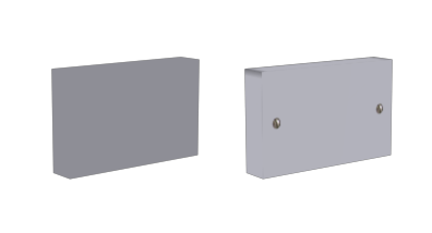
Really simple and boring box model for the wall plugs, really only real time went into the texture, which even then is flat. Minor detail that will not be noticed in the game, if even used.

Another simple and quick model, the same as the wallplug model, just a box with simple texture on it.


Managed to keep this very low poly'd despite the extra need for detail. Textures played a big part once again for these low poly models. Looking forward to seeing how the shaders in unity will look on the light.

I also produced a few extra tileble textures for the SU, as well as improving some of the older tiled textures, namely getting rid of shadows and trying to make them more seamless.


Nothing special really, but I wanted to at least have a few textures ready for when I have to start texturing the walls and floors of the SU itself.


Game Mechanics 4 - FIller Models

This week of the SU project, I was merely texturing and producing some of my own filler models to help populate the environment, whilst the bigger models were being created and worked upon.


This model was really basic, and easy to do, just a thin box that I manipulated into having curved sides. Put very little detail into it as it will be one of those models that will go unnoticed.

Another quick model, which was for the fire alarm. Again I tried to keep the polys and detail low, as it would only be viewed from far away, the textures are also low in size for that reason.
Although as small as the fire alarm, I had a bit more opportunity to add detail to this model. I had more fun with it, as I feel the texture was a nice and accurate portrayal of the actual object.


The last model I did myself for this week, was for the black candle shaped light. Had more fun doing this model than the others for obvious reasons, I had the opportunity for a bit more detail but at the same time I had to ensure the poly count and verts were as low as possible for optimisation sake.


Black Square Board model by Martin Garnett.

For this model I just had to simply texture the two sides, and add a wood trim. For the moment the black paper is a flat colour, but in the future we have discussed adding a normal map to it, in order to give it crinkles, detail and depth.

Overall I had fun producing some of my own models for the project, although only minor additions I was glad to be able to keep the workflow going.